
ABC: Tampa: The Turning Point
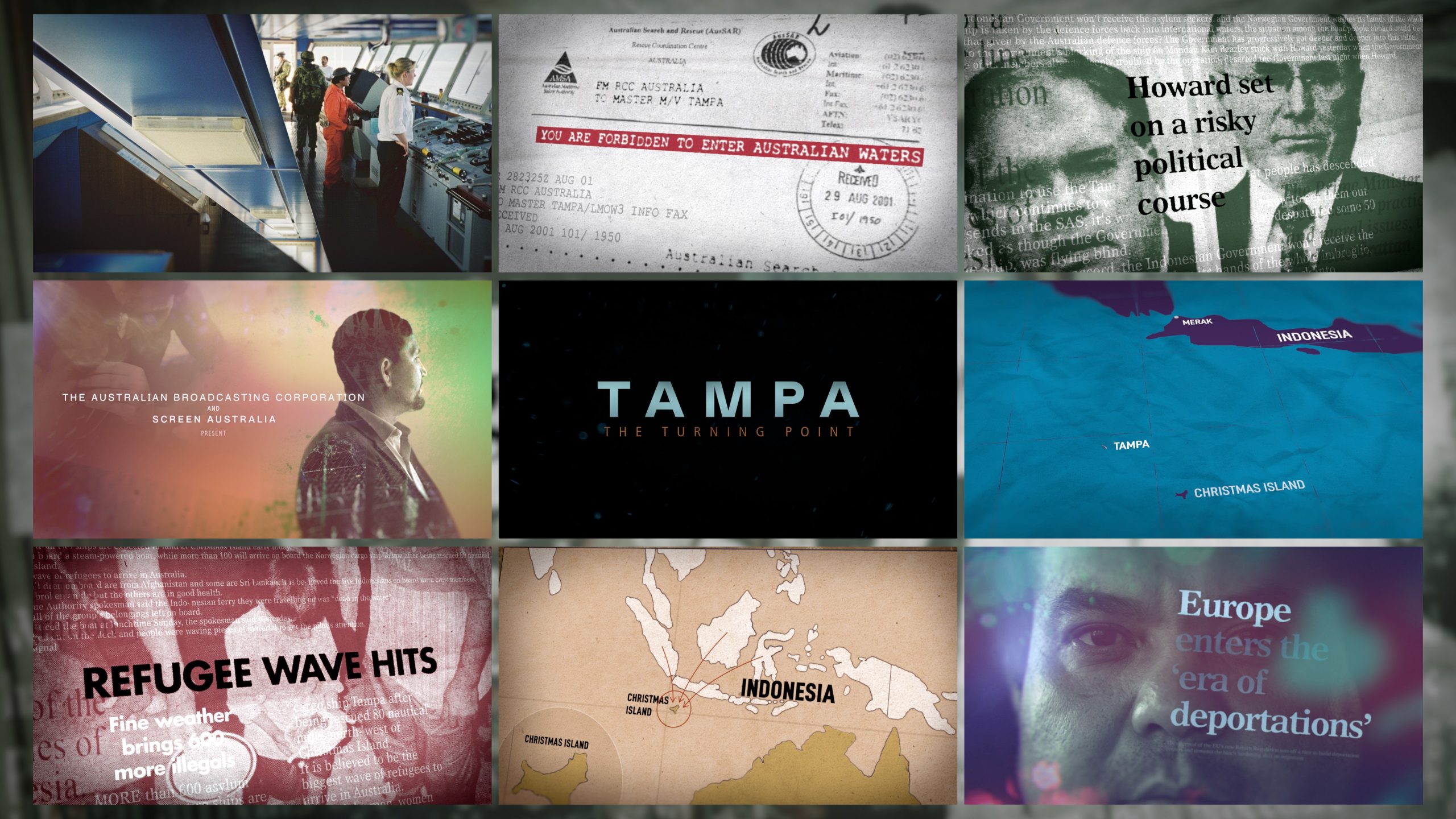
We collaborated closely with director, Kriv Stenders, series-producer, Ili Baré, and line-producer, Sarah Charley, from Mint Pictures who are based in Sydney, Australia. Tampa: The Turning Point is a three-part series that takes us back to the events of 2001, when the MV Tampa rescued 433 asylum seekers stranded in the Indian Ocean. The rescue quickly escalated into an eight-day political and humanitarian confrontation with the Australian Government, becoming one of the defining moments in the country’s immigration history.
Tampa: The Turning Point – Graphics Reel
Title Sequence
Not wanting to lose sight of the human side to this story and the anguish endured by those on the ship, we built our shots around videos of the survivors. We carefully masked out the video footage, and superimposed images and news headlines over the top to build a sense of the story unfolding.
We composited all of the imagery together and introduced a halftone effect to tie it into the wider graphic language of the series. This helped give the imagery a more traditional print aesthetic, reflecting how big the story became at a time when social media wasn’t yet a part of the conversation.
As the story grows, we created a sense of scale through imagery of protestors and politicians from around the world, showing how the story developed into a truly global one over the past 25 years, while highlighting themes that are still very much prevalent today.
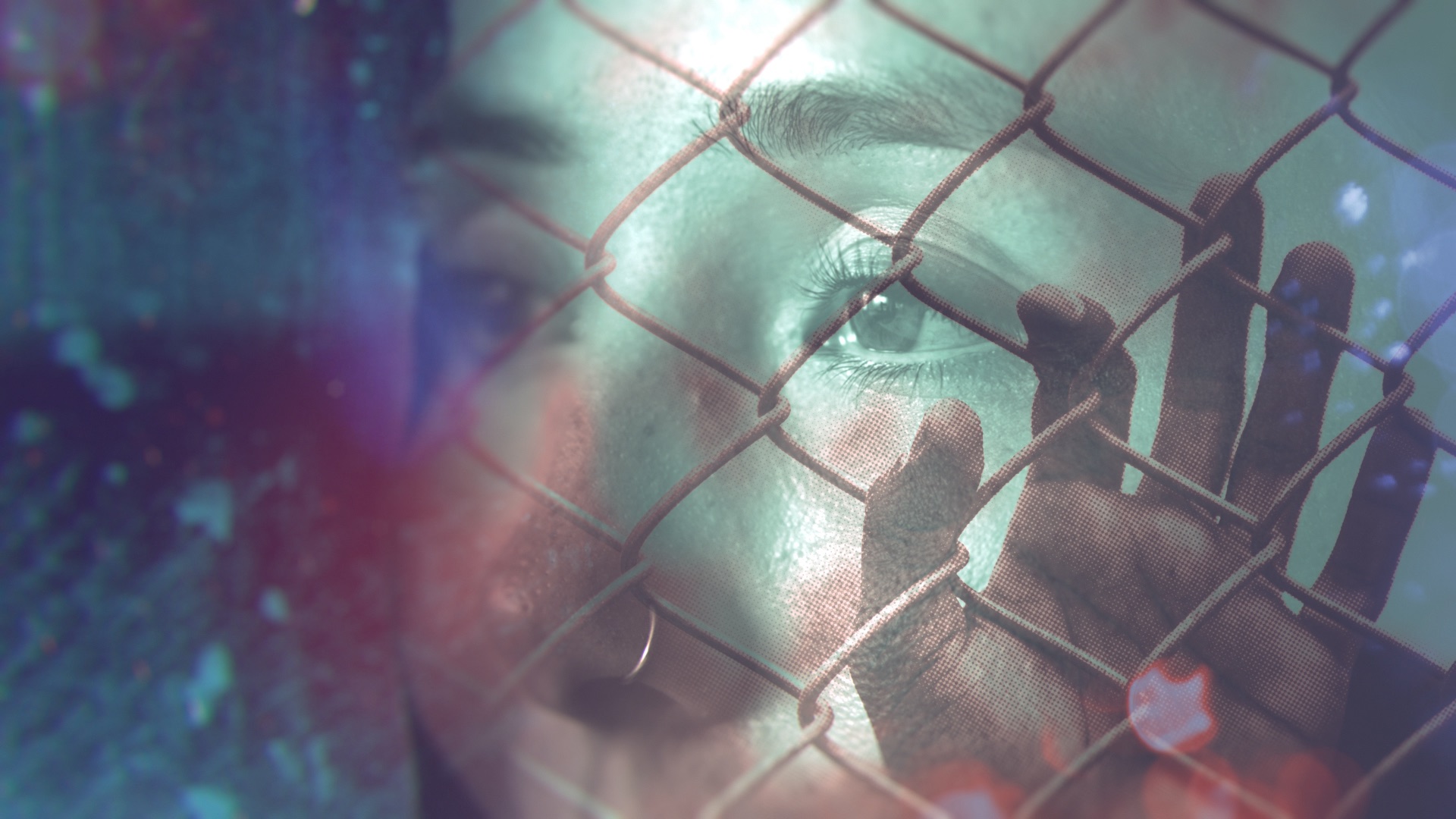
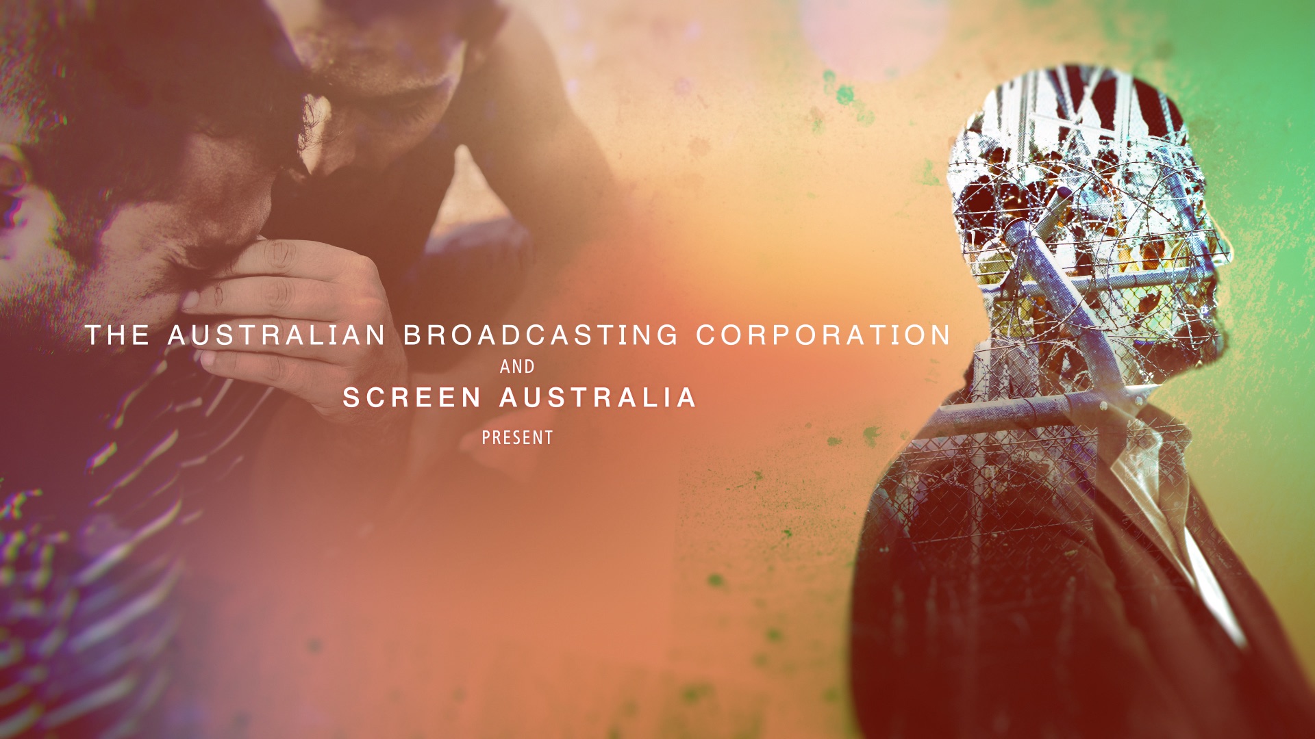
Photo Treatments
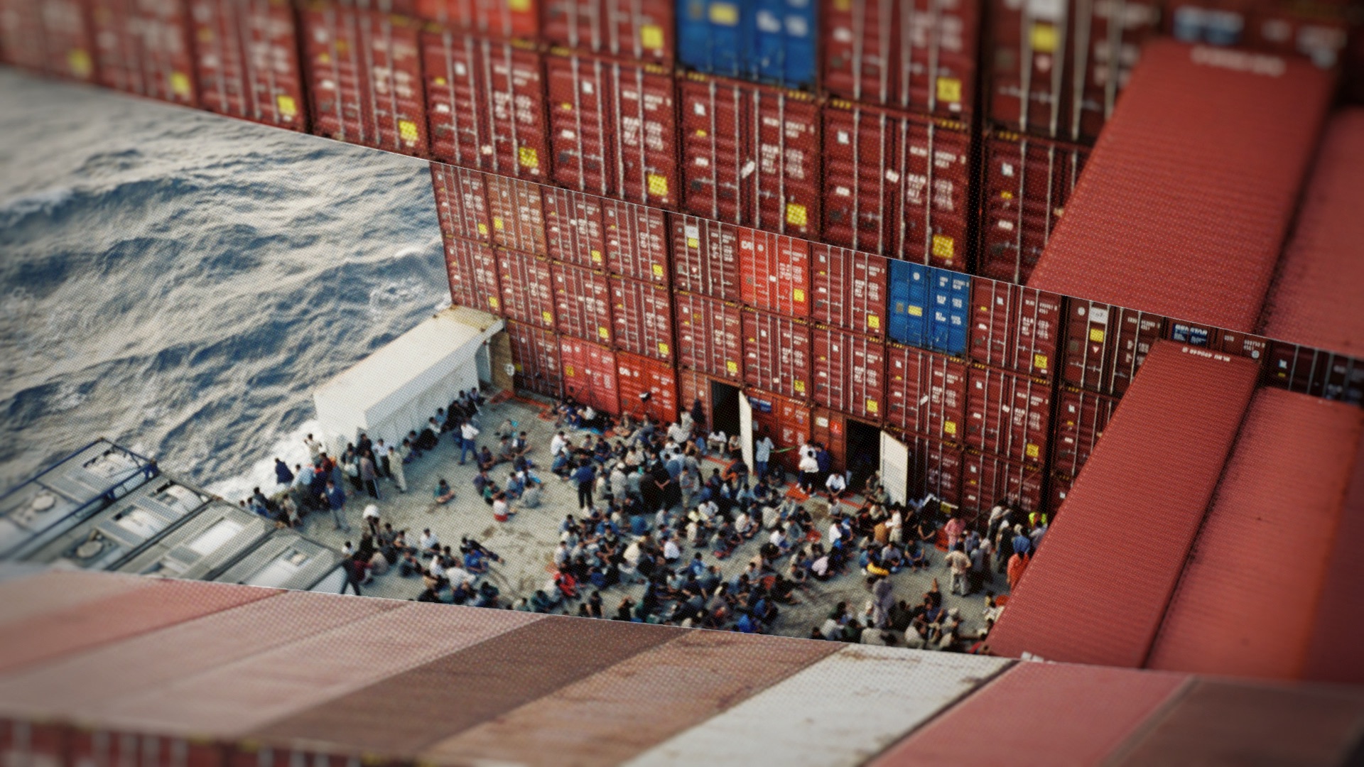
We wanted to emphasise the isolation and claustrophobia felt by the refugees trapped on board the Tampa. So we have framed the key images with other photographs which are always closing in on the key images. Like the nauseatingly constant rocking of a ship on the waves, everything in these sequences are always moving.
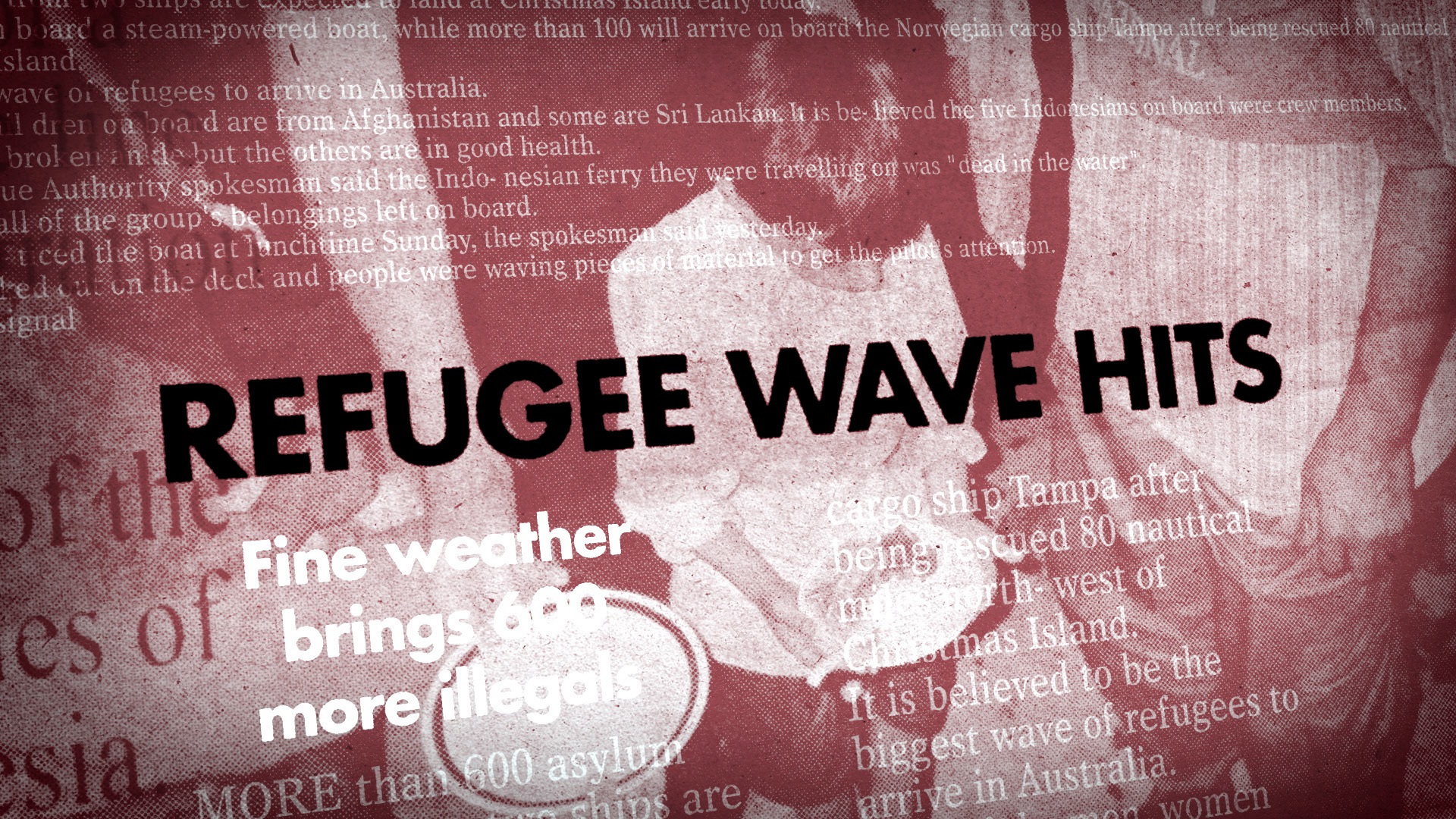
Newspaper headlines
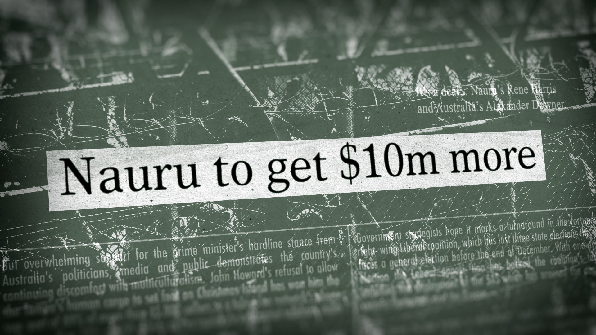
The conversation surrounding this event was vast and worldwide, it was important to show this scale in our graphics. To do this, without newspaper assets, we recreated and embedded our key headlines into a three dimensional news world. Surrounded by other articles and imagery, the main headline becomes the focus while still giving a sense of the wider story and the huge amount of attention it received.
Communication & Timelines
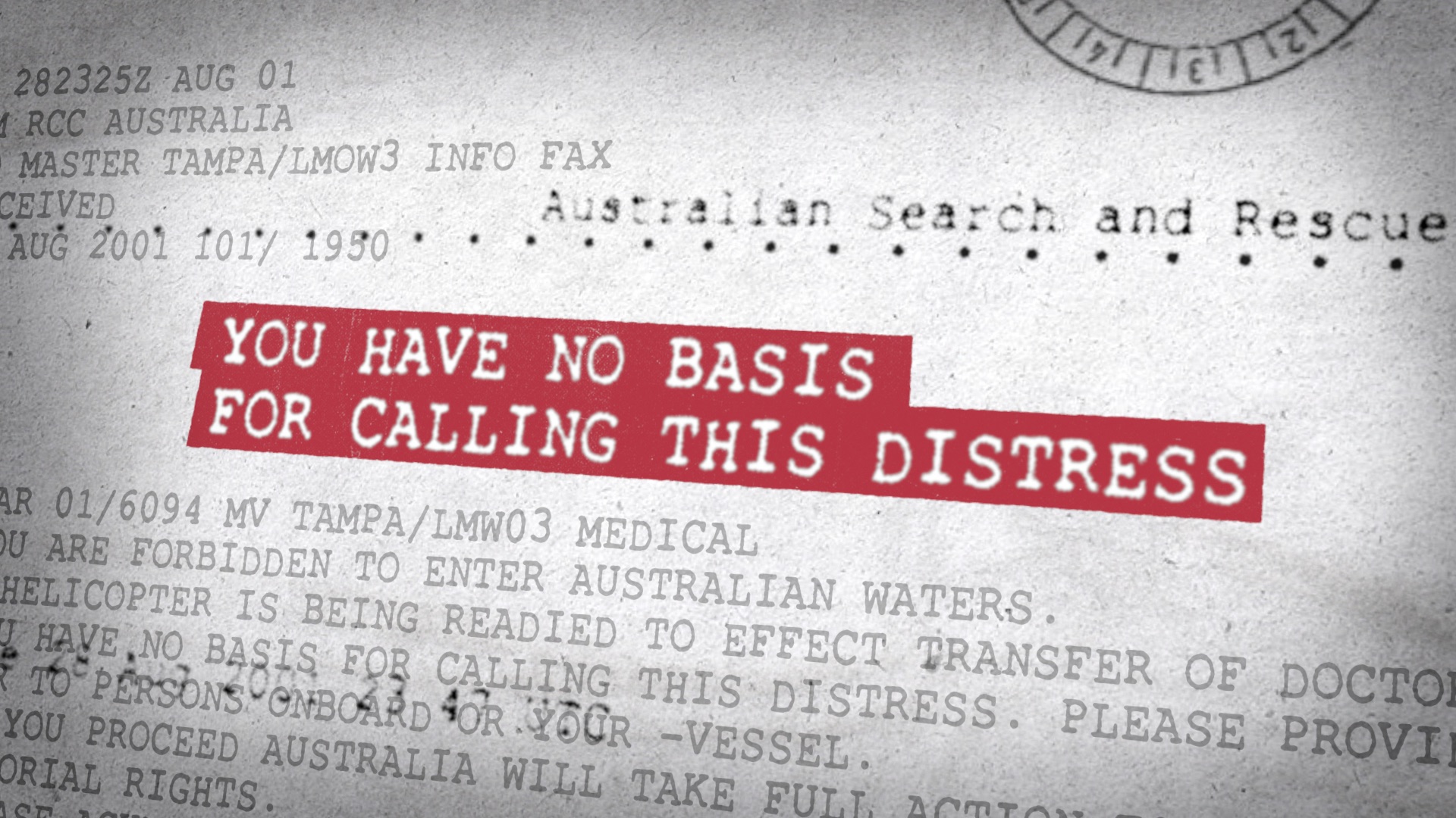
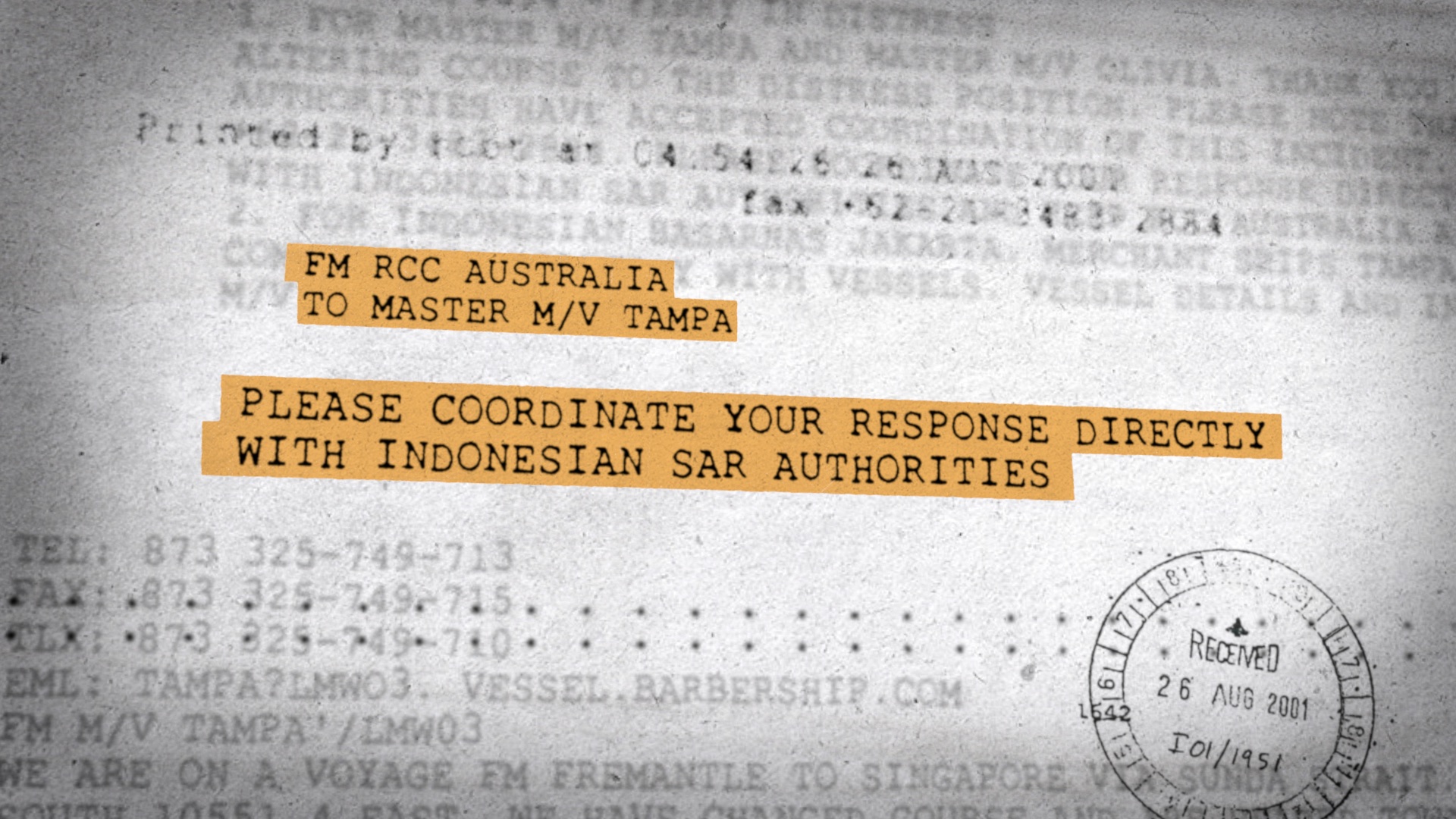
We were tasked with bringing the messages between the Tampa and the Australian authorities to life, which were being passed back and forth by fax at the time of the incident. We were given the original fax assets, but recreated the key messages and introduced a highlight effect to draw attention to the pertinent information.
As these were faxes, we knew the treatment couldn’t follow the same texture as the newspapers. However, to tie these communication shots into the wider graphic language of the project, we continued with the three dimensional style, using the surrounding text to create depth while keeping the focus on the main message.
Maps
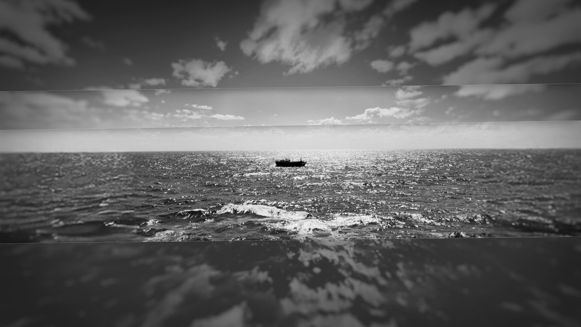
We worked closely with Kriv and Ili on the design for the maps before landing on the final style. We wanted them to feel like more than just flat 2D graphics, and give the maps a sense of depth and space.
The trickiest part of the shots were combining the 2D and 3D elements and getting the camera angle to work seamlessly with the boat and the surrounding environment. We had to make sure the lighting and shading felt right for the direction the boat was facing, while also allowing for the big, sweeping camera moves.
Titles & Motion Design
Past Curfew
Design Director
Allison Brownmoore
Production Manager
Mark Hughes
Designers
Kevin Smy
Sylvain Doussa
Callum Welch
3D Animator
Ploy Jeana Li