
ABC: Tampa: The Turning Point
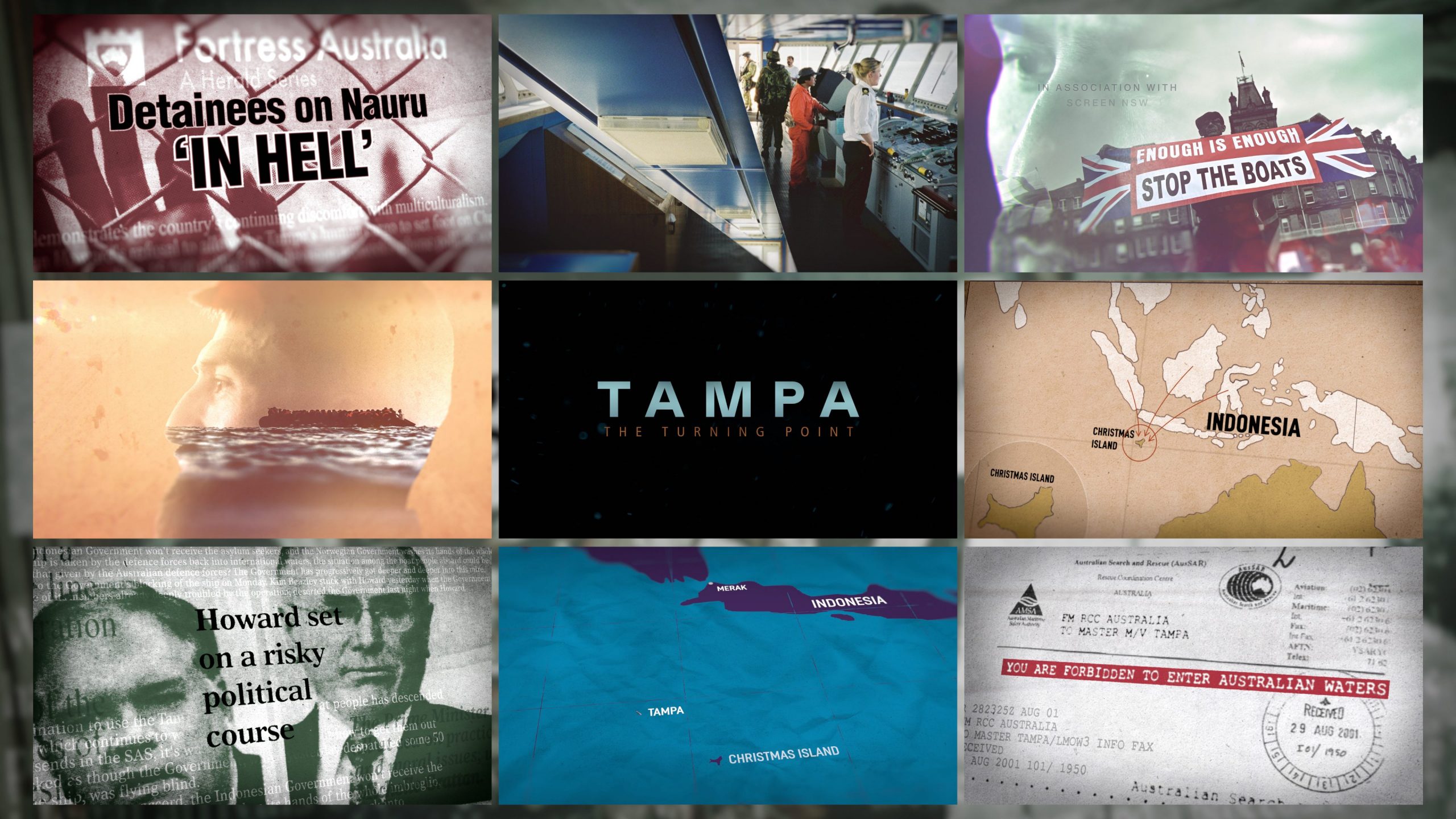
We worked closely with the Sydney based team, and director Kriv Stenders. Tampa: The Turning Point is a three-part series that revisits the events of 2001, when the MV Tampa rescued 433 asylum seekers stranded aboard an overcrowded vessel in the Indian Ocean. The rescue quickly escalated into an eight-day political and humanitarian confrontation with the Australian Government, becoming one of the defining moments in the country’s immigration history.
Tampa: The Turning Point – Graphics Reel
Title Sequence
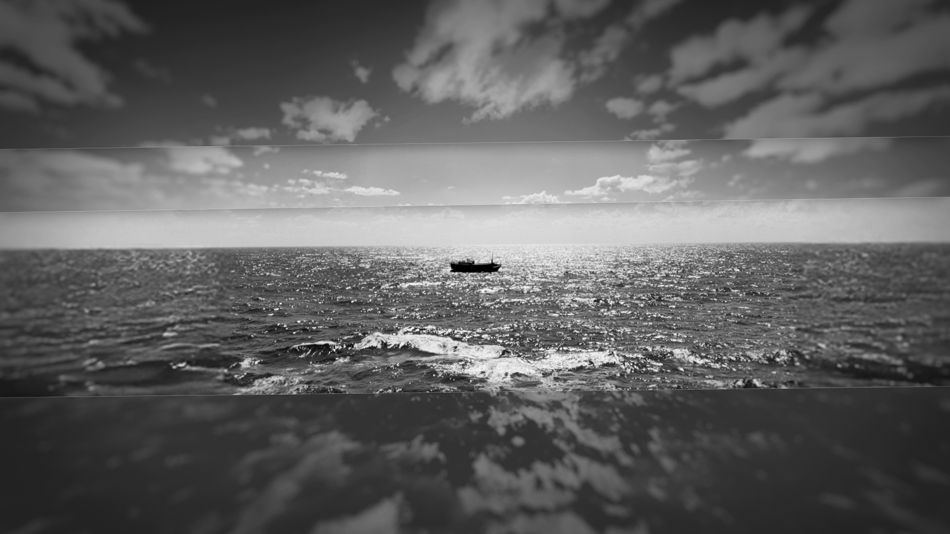
Through this title sequence we wanted to introduce the audience to the world in which this event happened. A complicated political landscape where right and wrong is different from person to person and country to country as the ramifications of this event spreads all across the world. We sourced images, videos and news articles and created a cinematic mixed media look to represent the convergence of different political views. Blues and oranges evoke the isolation of endless sea, and the threat of the burning sun.
Not wanting to lose sight of the human side to this story; the tragedy endured by those of the ship. We build our images around videos of the survivors, all the drama and conversation happening around them. They are helpless, and can only watch and wait as their fate is decided by politicians above them.
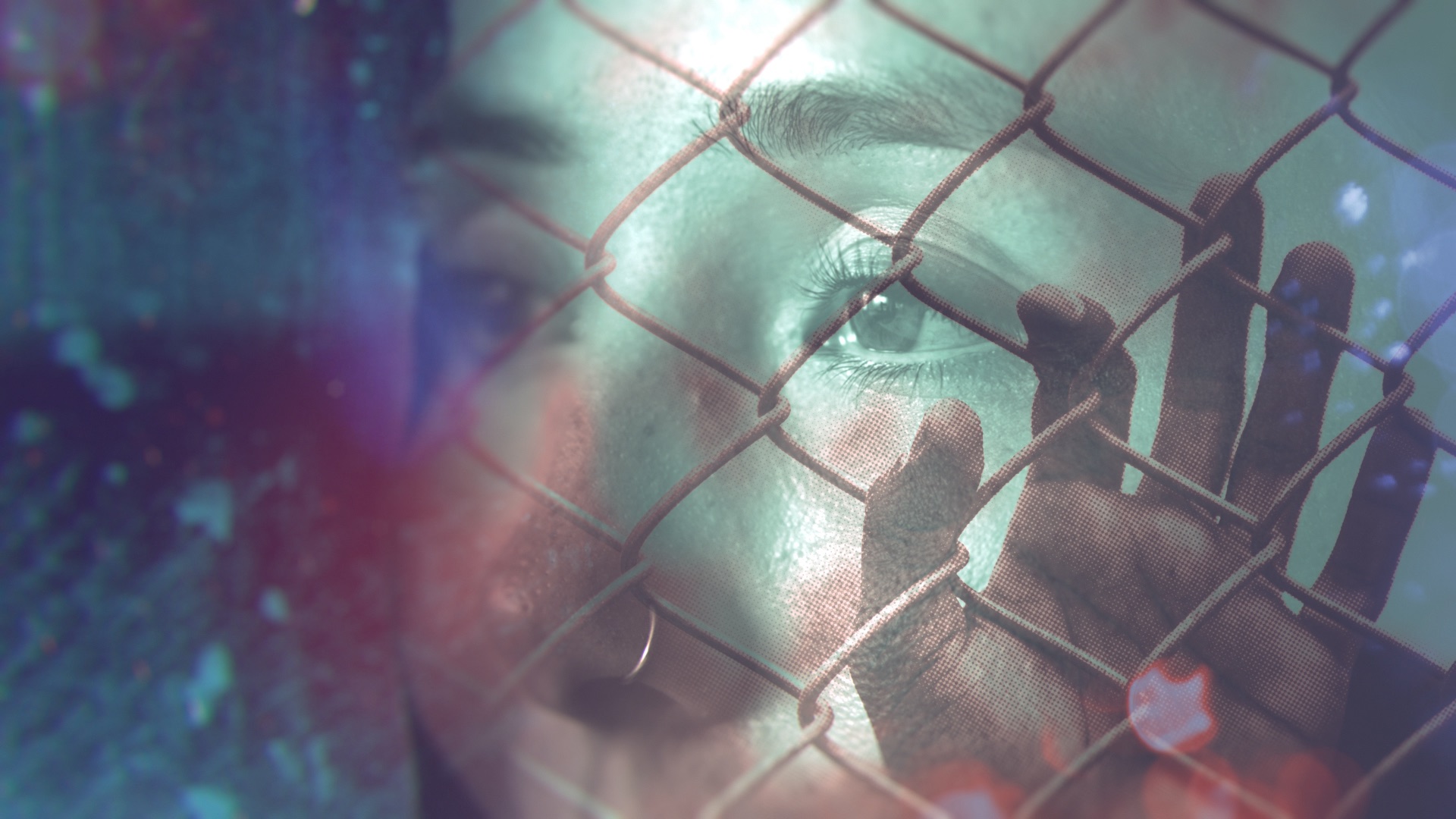
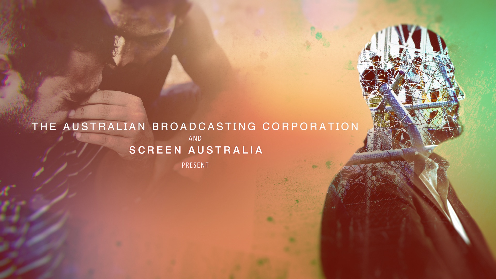
Photo Treatments
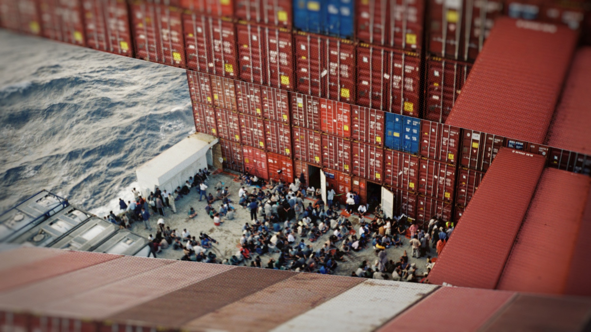
We wanted to emphasise the isolation and claustrophobia felt by the people trapped on board the Tampa. So we have framed the key images with other photographs which are always closing in on the key images. Like the nauseatingly constant rocking of a ship on the waves, everything in these sequences are always moving, creating the sense that time is running out for these people.
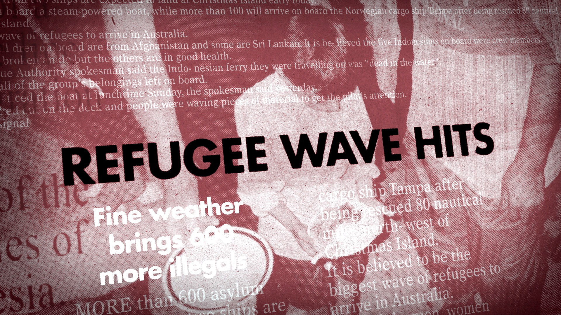
Newspaper headlines
The conversation surrounding this event was vast and worldwide, it was important to show this scale in our graphics. To do this we embedded our key headlines into a three dimensional news world. Surrounded by other articles and images, we can focus on our main headline but get a sense of the context around it.
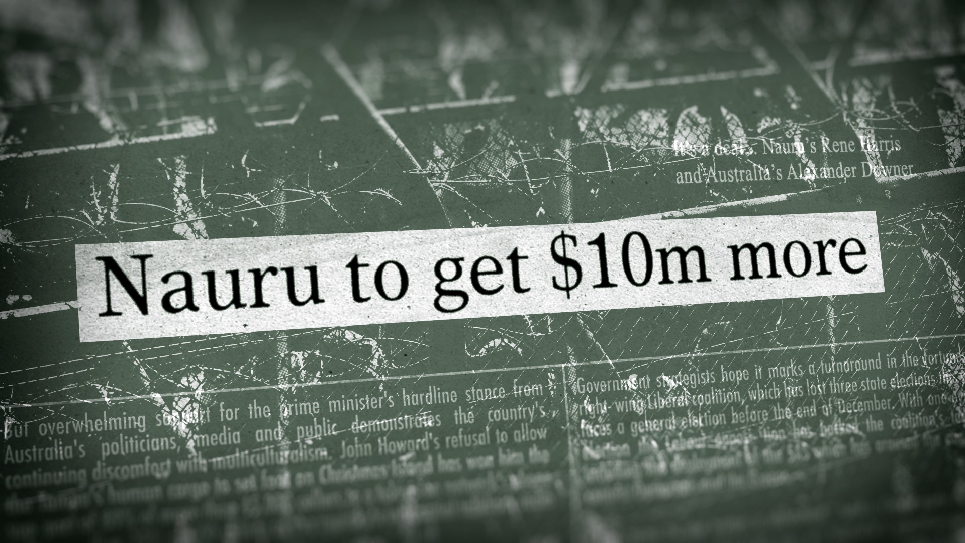
Communication & Timelines
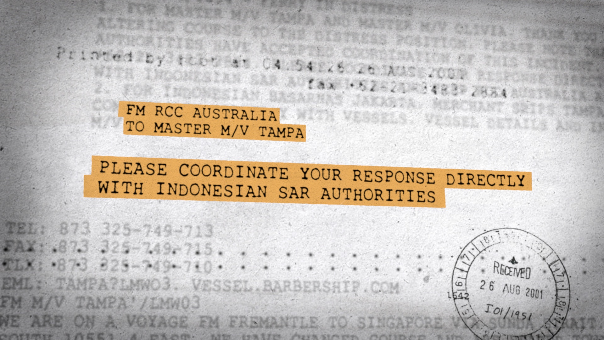
To tie these graphics with the newspaper articles we kept these in the three dimensional world. But these letters are handwritten, so a tactile and intimate style was needed to portray the more personal tone of these messages. The layering of handwriting behind the key text represents the voices of everyone trapped on the boat.
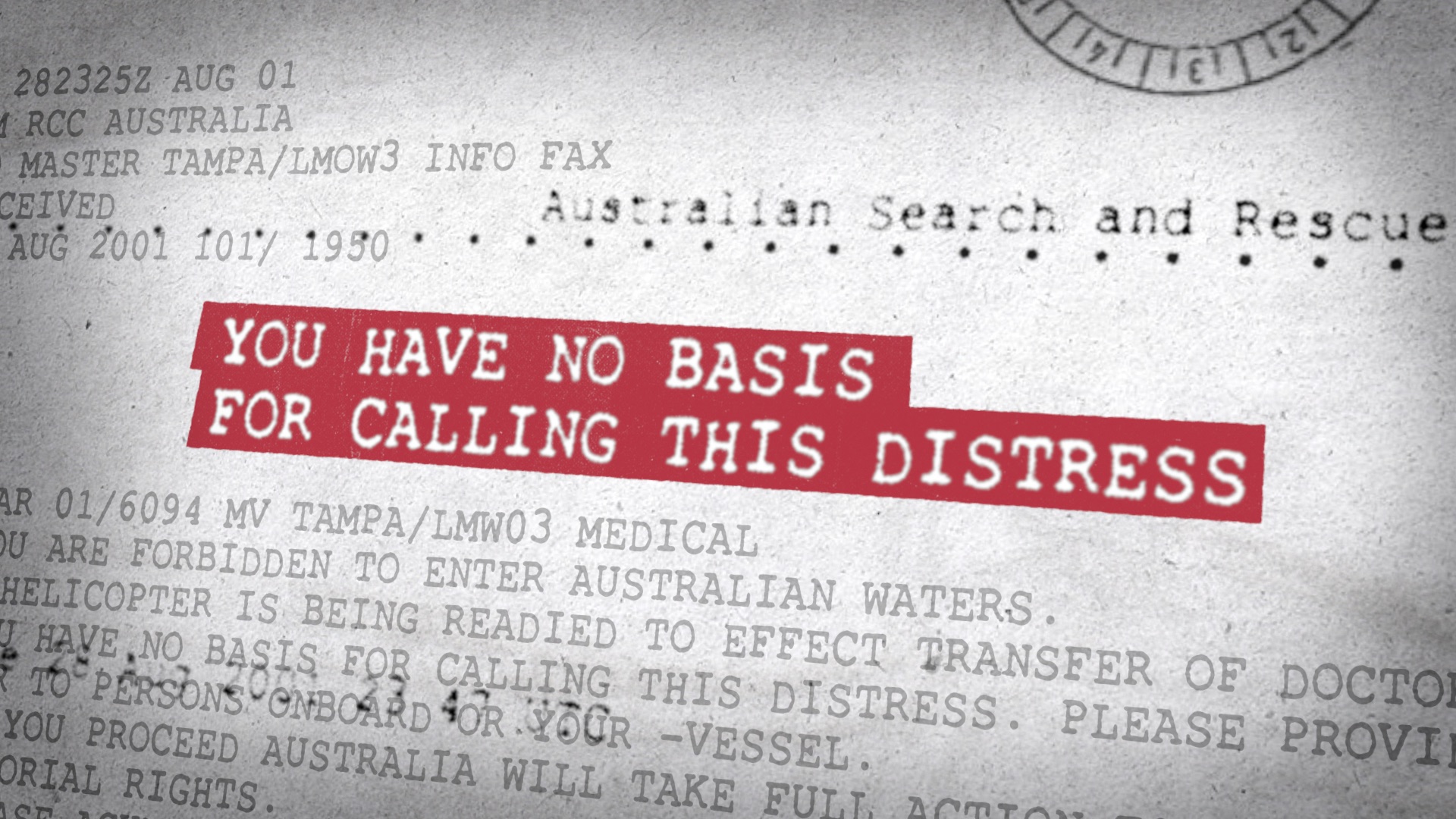
Titles & Motion Design
Past Curfew
Design Director
Allison Brownmoore
Production Manager
Mark Hughes
Designers
Kevin Smy
Sylvain Doussa
Callum Welch
3D Animator
Ploy Jeana Li