We were approached early in the edit to develop a visual language for the films graphical elements which felt genuine to the films subject, Ranulph Fiennes. Working with the incredible wealth of archive within the film, it was important to capture RAN with his true spirit. Despite his privledged upbringing, RAN is a down to earth individual with character, and we wanted to embrace not only his ‘rough around the edges’ approach, but also the spirit and vitality he employed throughout his incredible life.
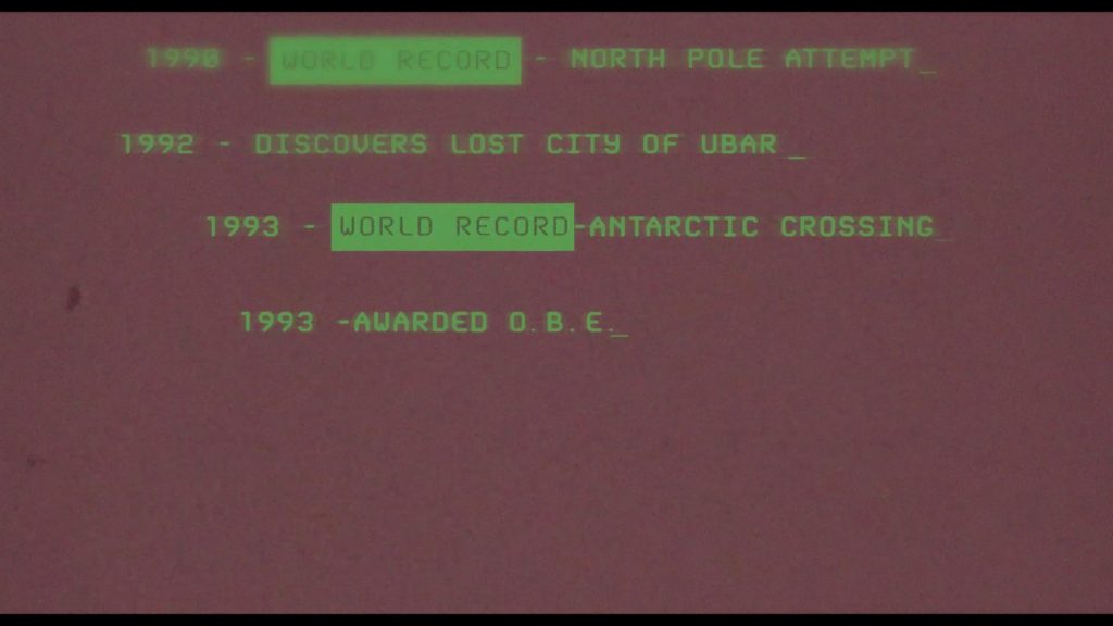
Our first exploration involved the title sequence, a one minute overview of Ran’s significant achievements, interspersed with poignant moments which revealed his unique character. Working closely with director Matt Dyas, it was important we didn’t over hype this sequence, his achievements spoke of themselves without the need for us to embellish. We adopted a tone which felt genuine to Ran’s character, employing a multimedia approach to give a tactile feel to the sequence. We shot various elements such as tipex spilling, lettering being rubbed out, dirt smudging, paper scrunching – and composited these elements into the sequence. This was also important to create that strong vitality, keep the energy rough and frenetic, enthusiastic without bravado.
See title sequence below >
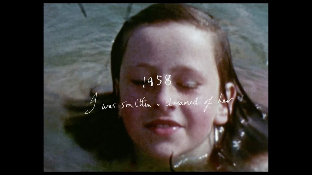
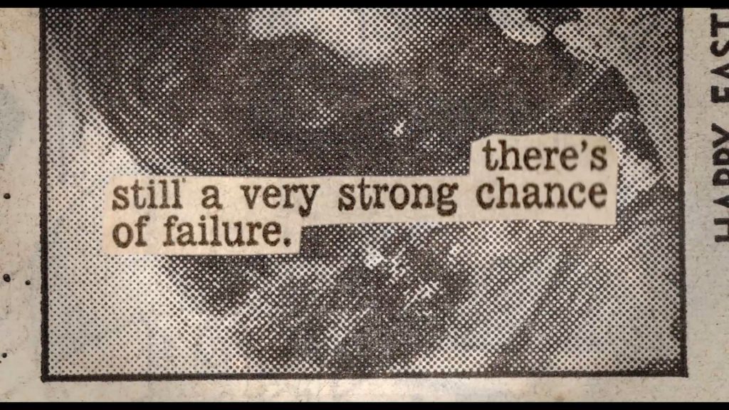
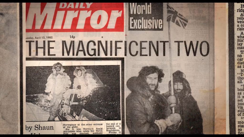
Within the film itself we also worked on several sequences. These ranged from photographic sequences to archival recreations.
Within films with strong archival sequences, often it can be jarring to withdraw from these moments to have a graphical interruption which aids information but threatens viewer immersion. We often work closely with archival references to create shots with an archival aesthetic which slot within these sequences without jarring the viewer.
We are thrilled to have the film to be released theatrically by Universal earlier this year, and look forward to the wider release coming shortly. Working with Matt and the team was such a pleasure and we are honoured to have been involved in the story of this incredible individual.
Design Director: Allison Brownmoore
Assistant Producer: Lucy Beavis
Artists: Allison Brownmoore, Ned Jackson, Kevin Smy