
“From power struggles to global politics, this Netflix series is an exploration of FIFA which reveals the organization’s checkered history — and what it takes to host a World Cup.“
We came on board early during the production process, having worked with director Daniel Gordon for several years. Dan was interested in developing an aesthetic which lifted the Netflix series, and also importantly provided clarity to a complex system of people, internal hierarchies and specific events.
Our involvement involved episode specific titles, opening cards, heirachy structures, newspapers and a range of episode specific sequences.
We delivered over 100 sequences across the four episodes, delivering UHD SDR EXRs to the London based online.
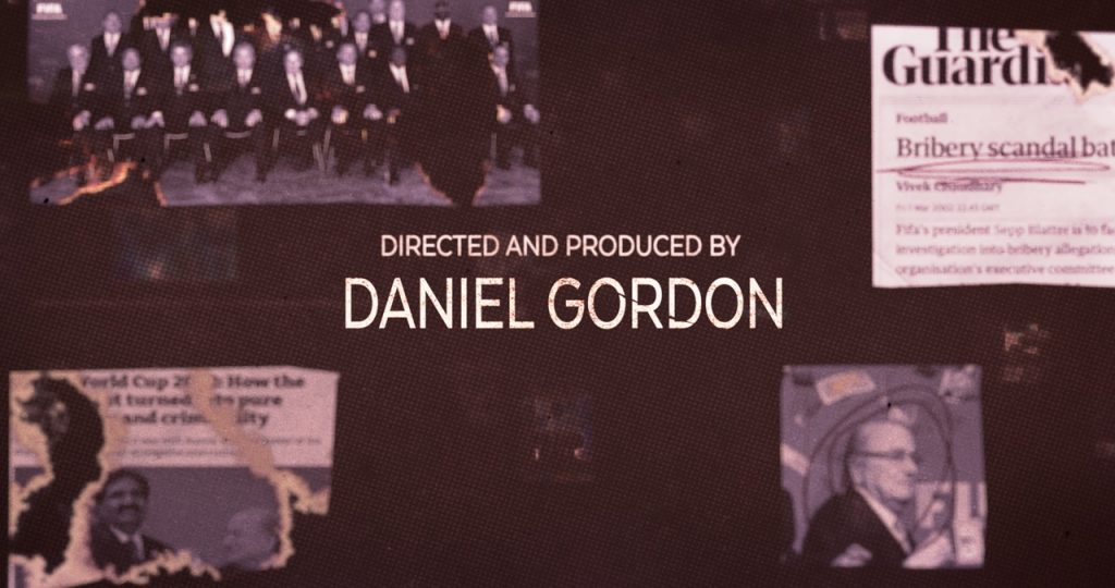
Title
Our title card was designed to the original title – THE FALL OF FIFA. Inspired by the preceding shot of flames in the first episode, we wanted our title to feel alive with destruction. Held together momentarily, then our letters crumbling with the weight of truth. Incidentally the title of the series changed at the last minute, as we hit online, so a quick amend to create the animation to the revised title, FIFA UNCOVERED. Nothing like a last minute title change!
Hierarchy
Employing a graphical device to explain the complex internal hierarchy within FIFA was critical to the series. It was important that this hierarchy altered over time, as the truth behind the corruption was revealed. And furthermore it was critical that legal sensitivities were also employed, in how these hierarchies were displayed and within other graphical sequences where those accused were being named.
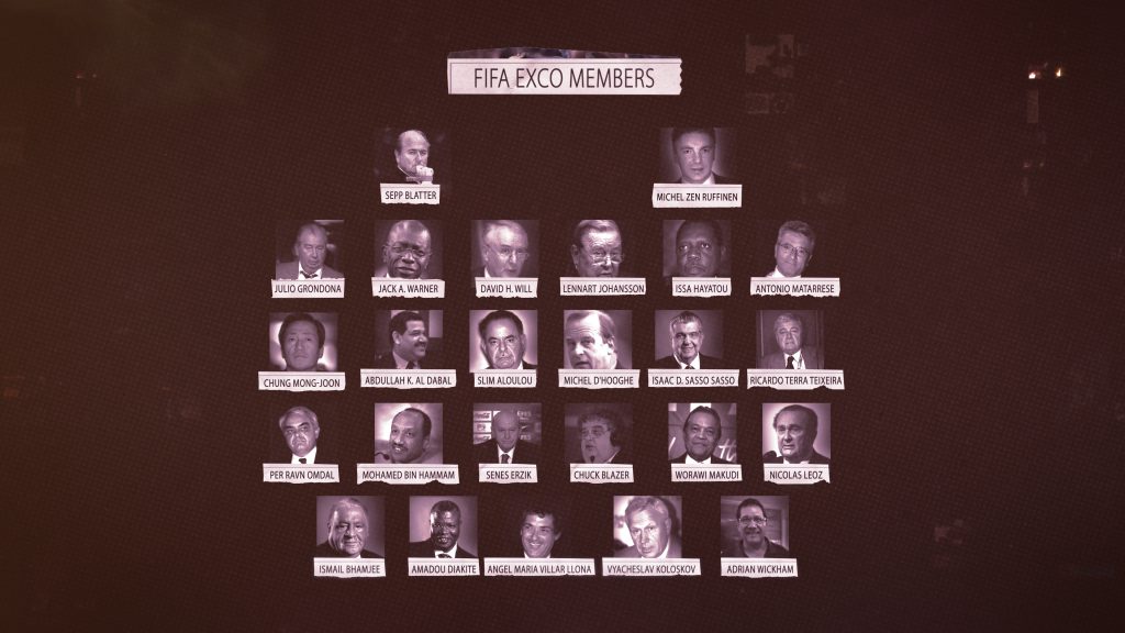
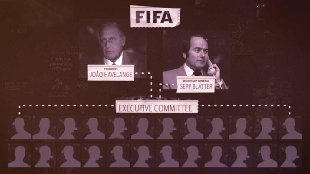
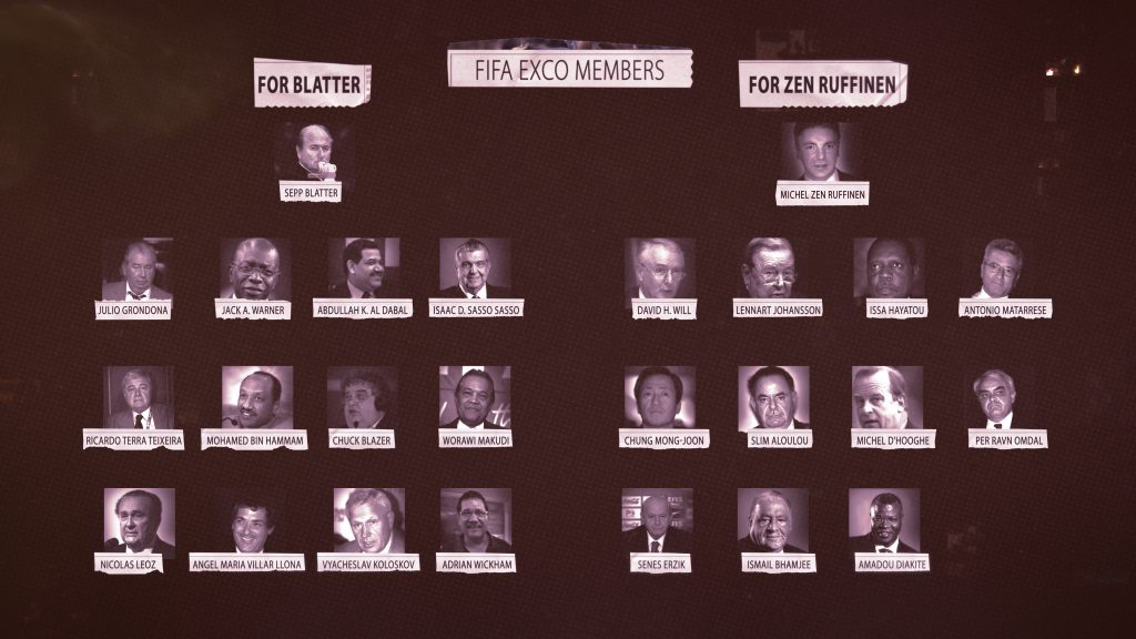
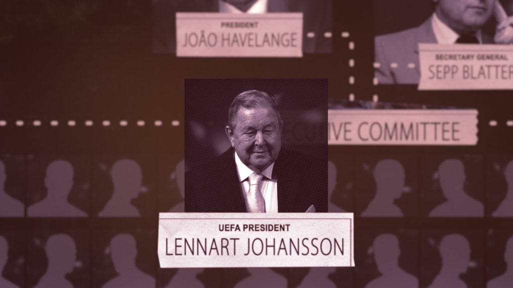
Hierarchy Evolution
As the series progressed, it was important for our hierarchy to alter both in content and aesthetically. In our final episode, the change had evolved to reveal the accused individuals.
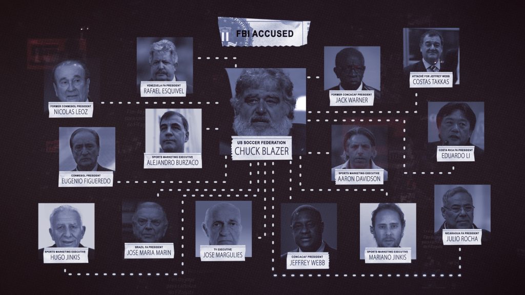
Graphical Explanations
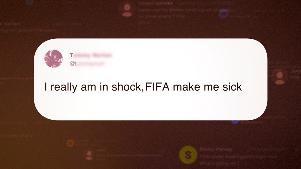
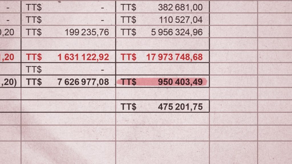
Through the series there were several moments which required graphical explanation. These were bespoke designs which arose throughout the offline, and we worked closely with the team to ensure the elements were supportive of the narrative. As such, we had a strong element of flexibility during our working on the project, to give space to the additional workload as the series progressed.
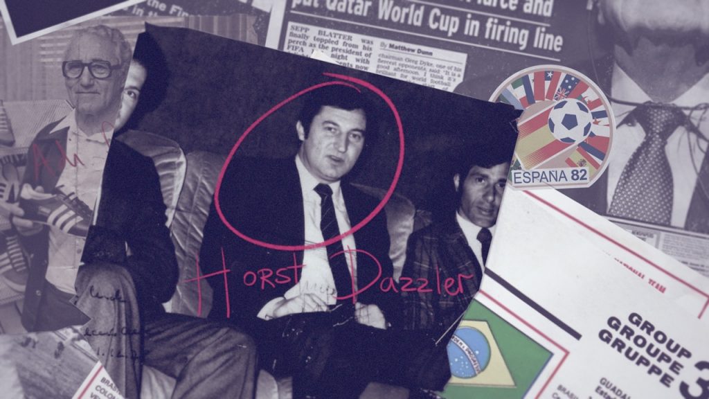
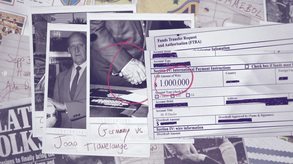
Social Media & Documents
Summary
We delivered over 100 sequences for the four part series, to the London based edit, in a condensed time period. It was a pleasure working with the team again at Ventureland and Very Much So and of course the team at Netflix!
Animation & Motion Design: Past Curfew
Design Director: Allison Brownmoore
Graphics Producer: Lucy Witts
Designers: Kevin Smy, Sylvain Doussa, John Quinn, David Bauer, Gloria Gemignani, Aaron Diamond
